[Reblogged from its original posting on the Vermont College of Fine Arts Launchpad.]
 ‘m so very pleased to have the opportunity to interview artist Shane Rebenschied about his work on the cover art for Trent Reedy’s latest novel, Divided We Fall. The cover is evocative, gritty, and stop-you-in-your-tracks compelling.
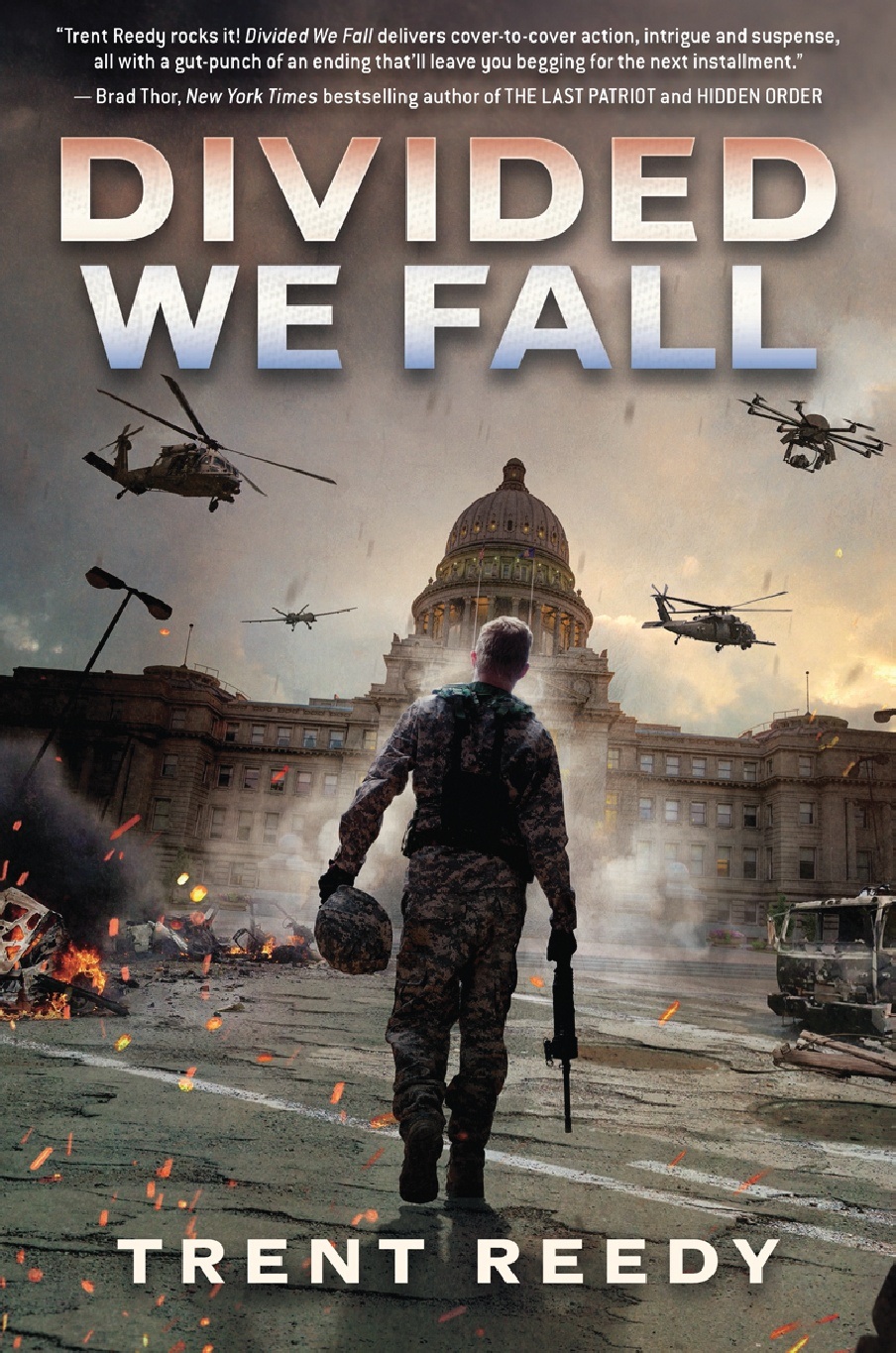
by Trent Reedy (Scholastic 2014)
CB: Greetings and welcome, Shane! Your cover for Divided We Fall is so full of motion, depth, shadow and light. I see from your portfolio that many of your other illustrations capture these qualities as well. Tell us a little about your process and how your methods influence the look of your work.
SR: Hello, and thank you for your kind words and for the opportunity to talk about my process!
My mother is a fine artist and I grew up hearing about how it’s all about light and shadow. That, coupled with the fact that we’re tuned–as a species–to focus on areas of high contrast, I really try to have a lot of lights and darks in my illustrations to help them better stand out on the shelves or even when skimming through an ebook store on a small screen. Doing artwork for book jackets is a balancing act between trying to make a beautiful image as well as something that sells the book and the story by creating an eye-catching image. Photoshop has a neat panel called “Navigator” that shows the image you’re working on but at a much smaller size. As I construct a cover image I’m constantly looking at the Navigator panel to see how the image translates when seen small, which really breaks it down to its basic structure. Before Photoshop, my mom taught me to do this by just squinting my eyes which removes detail and just shows you the lights and darks. Looking at your artwork in a mirror is also a great way to separate yourself from the image and it helps to highlight any issues you might be having with the composition.
With regards to how this influences the look of my work, it’s another balancing act between photography and “traditional” illustration. While my art definitely errs far to the side of photography (specifically photo manipulation), by incorporating hand-painted elements and textures together into crafted environments that don’t exist in life I try to bring a bit of that traditional illustrative process into the final illustration. I will lean further to one side or the other depending on the look the client is wanting for a particular cover but my hope for each illustration is that it is neither photography nor illustration but instead something in between. Additionally, my general rule is to try to make each cover illustration better than the last one and I think of that throughout the process.
CB: When I first laid eyes on Trent’s cover, I was struck by how much information is conveyed in the figure of the soldier. Even though he walks away from the viewer we still sense a certain confidence–but also caution–in his bearing. We can tell by the lanky way he carries himself and by the way his uniform hangs that this soldier is very young, and I find it utterly amazing that you were able to capture that. What sort of preparation and research did you have to do before rendering Danny?
SR: While I’m sometimes given the manuscript to read in order to offer my own ideas into the cover process, the amazing art department at Scholastic–with the help of Trent!–had already gathered together a wealth of information regarding Danny, how he should be dressed, equipped, and how he should look. With that in-hand I grabbed a local model that I had worked with before that I knew would be perfect for this role and we set about shooting several hundred photos of him in various poses and gear configurations. From there it’s all about working with the Art Director at Scholastic, Chris Stengel, to find the best shot that really captures the character. So, to more simply answer your question, I didn’t have to do much research for this cover at all! With the help of Trent, who is always awesome at supplying great specific material on what the character should have/wear, and the Art Director, that part of my job was taken care of.
CB: How is designing a book cover different from other illustrations you do? At what point does an editor or art director enter into the process, or do you make most of the decisions (typography, layout, etc.) on your own? Did you receive much direction from Scholastic or from the author before you started to work on the cover for DIVIDED WE FALL? If so, how do those considerations affect how you approach the project?
SR: 99% of the illustrations I do for clients is book jacket illustrations and I’ve pretty much been specializing in doing just that since I graduated from art school 14 years ago. When time allows I like to illustrate book jackets for non-existent books as it allows me to do whatever I’d like (I find it akin to stretching your muscles after getting up in the morning). I’m fortunate in that when I have the spare time, I choose to spend it creating covers for imaginary books! It helps that some of those covers (Link) get seen by publishers and help to bring in new work.
Art Directors are always intimately involved in the cover process from the very beginning. While sometimes I am asked to come up with my own ideas for the book jacket illustration, more often than not by the time I am brought on to create the illustration the Art Director has already read through the manuscript, collaborated with the editor(s), other Art Directors, and sales and marketing to decide on a cover concept. There is, of course, some flexibility in there but usually the cover direction has already been decided by the time I enter the process. For DIVIDED WE FALL, the Art Director had a few ideas in mind and from that I created the first concepts and we ran from there. I believe the initial direction was something to the effect of “Danny walking or running toward or away from the viewer. Idaho capitol building in the background. Drones/helicopters flying overhead. Needs to look dramatic. Forced perspective.” As I’m sure authors will tell you, sometimes the book just writes itself. Other times you have to beat it into shape with a stick. Artwork is the same and, fortunately, DIVIDED WE FALL fell into the former and the illustration changed very little from the first concept to the final cover. It just created itself, with a lot of help and guidance from Chris!
With regards to the typography and layout, that is almost always the job of the Art Director or an on-staff designer. I need to keep the cover design and title in mind while working on the illustration and to make sure I leave space for them, but I don’t usually delve into the world of designing the cover layout. Every rare once-and-awhile I get to contribute however.
CB: Have you been awestruck by the cover art on any other books lately? Please share. Alternatively, what about a book’s cover art makes you want to pick it up?
SR: I’m always awestruck by other cover art. I’m usually drawn to cover artists who are able to bring great, consistent light throughout the whole cover illustration. I find creating consistent light to be one of the most difficult aspects of creating a strong and unified illustration. Additionally, I love seeing illustrations that aren’t tied as much to depicting reality as I am, and it’s one of the things I’m making attempts to address in my own work. By “tied to reality” I mean that some artists can just create a shape, but because of how it looks and the context it’s immediately understood that it’s a building (for example) whereas I often feel compelled to show the building with every detail revealed. Suggesting rather than detailing.
Cliff Nielsen is fantastic in both these regards, is a far better artist than I, and I continually look up to his work.
Another book cover artist that I’m a huge admirer of is Chris McGrath. He always has great tonality in his images and does a fantastic job of suggesting vs. revealing all, as I was mentioning above. Chris’ work is without equal.
I also have a huge amount of respect and admiration for the giants of the illustration world that work in natural media such as Gregory Manchess, Dan Dos Santos, Sam Weber, and Eric Fortune. I grew up with watercolors and, later, oils and I would like to return to these mediums one day.
CB: Tell us about what you’re working on next. Also, I assume you’ll be creating the covers for books II and III of the Divided We Fall trilogy? Can you give up any hints about what they’ll be like? Please? We won’t tell, promise.
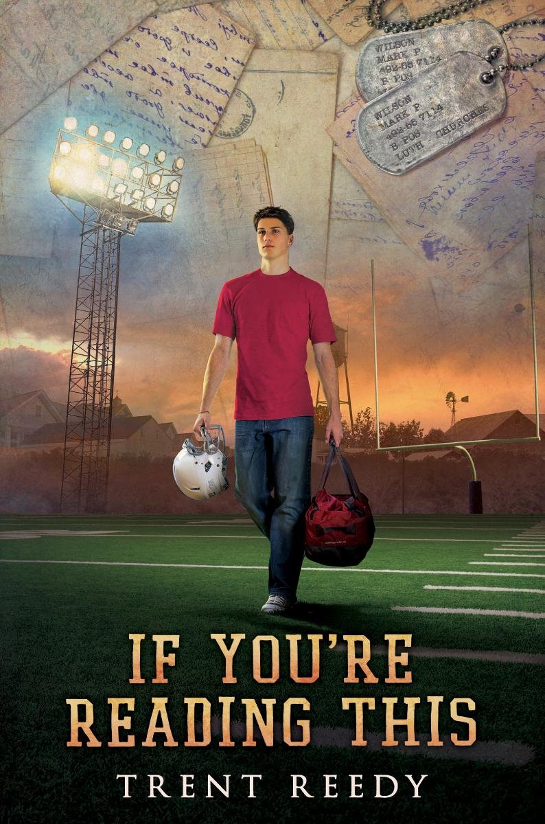
SR: Over the past few months my life has been consumed by illustrating the book jackets for John Flanagan’s THE RANGER’S APPRENTICE and BROTHERBAND series, but I also finished the cover for the second DIVIDED WE FALL book in early May as well as another one of Trent’s books, IF YOU’RE READING THIS.
If You’re Reading This
By Trent Reedy, coming fall 2014 (Scholastic)While I’m sure I would get in trouble if I spoke too much about DIVIDED WE FALL book 2 before it’s out on the shelves, I’m sure it’s fine to report that it’s certainly more explosive and dynamic than the first, while still retaining what works well from the first cover. Danny’s life sure does become a lot more exciting in the second book and I think the cover does a great job at reflecting that. Hopefully it’ll be out soon so everyone can take a look at it!
CB: Thanks a million, Shane, for giving us a glimpse into one artist’s piece in this fascinating behind-the-scenes part of the book business!
SR: Thanks again for the opportunity! We artists don’t often get an excuse to talk with the outside world.
Breaking News!
The cover for the second part of the trilogy, Burning Nation has just been revealed!
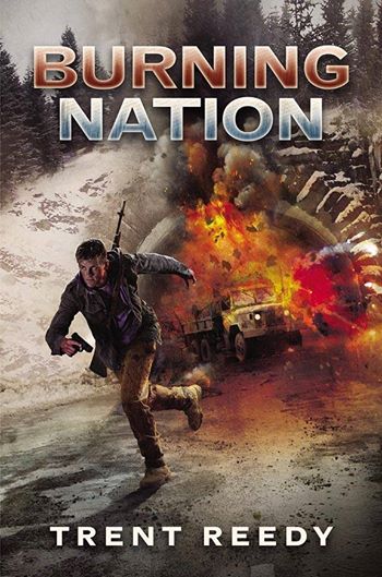
Burning Nation
By Trent Reedy (Scholastic)
Coming soon!